
ARISTOTLE DESIGN SYSTEM
The Autopoiesis Design System is the shared foundation behind Aristotle.
built to support an AI interface defined by multi-surface depth from root canvas backgrounds to elevated cards, sidebars, and dense reasoning panels. The system encompasses color, typography, icon sets, and UI components. Every architectural decision was made to hold up predictably across multiple model outputs, multi-layered layouts, and dynamic theme switching.
Role · Product Designer
Timeline · Oct 2025 - Ongoing
Team · 2 designers
CONTEXT & ORIGINS
As Aristotle transitioned from initial prototype to Beta, product velocity quickly outpaced interface consistency.
Localized, one-off component decisions began compounding, causing layout regressions, broken focus states, and visual fragmentation across features. The product required a production-grade foundation that could maintain architectural rigor without slowing down feature development.
THE CORE CHALLENGE: DESIGNING FOR DEPTH
Aristotle is not a flat interface; it is an AI tool built on layered spatial depth.
Surfaces stack conditionally depending on user intent: Canvas Background (page) → Primary Container → Secondary Surface → Elevated Modal / Panel.
The primary challenge was designing a system where components couldn't simply exist in isolation. Every element needed to maintain contrast, accessibility, and visual hierarchy regardless of which surface layer it landed on, which model powered the output, or which theme was active.
SYSTEM ARCHITECTURE
The system maps directly to how Aristotle is structured.
Each layer of the product has a corresponding layer in the system.

COLOR & SURFACE TOKEN LOGIC
Instead of managing static hex codes, primitive scales (Neutral 0 through Neutral 1500) map directly to semantic tokens structured around surface intent and elevation: page, primary, secondary, tertiary, subtle, and elevated. Each elevation step moves predictably along the neutral scale, turning spatial depth into an intentional visual and structural hierarchy.

Symmetric Dark Mode Inversion: Dark mode was designed as a mirrored token architecture rather than a manual override set. While the full neutral scale spans to Neutral 1500 (#000000), dark mode backgrounds establish their baseline canvas at Neutral 1250 (page). From there, the mirroring holds bi-directionally:
Light Mode Backgrounds: Start at Neutral 50 (page) and step lighter toward Neutral 0 (primary, elevated).
Dark Mode Backgrounds: Start at Neutral 50 (page) and step lighter toward Neutral 0 (primary, elevated).
Extreme steps (Neutral 1300–1500) remain reserved for high-contrast typography, icons, and borders across both themes.

Contextual Interaction & Status Tokens: Static fills are handled by background surface tokens, while user-triggered states (Hover, Active, Selected, Focus, Disabled) rely on targeted interaction tokens split across three functional groups (Neutral, Brand, Ghost). Interaction tokens are strictly bound to their underlying surface type to eliminate cross-group token bleed. Similarly, status fills map light tints (Green/50) to dark equivalents (Green/600) to guarantee legibility across state shifts.
Intentional Accent Usage: Brand accent tokens (Color/Brand/50 in light, Color/Brand/800 in dark) are applied selectively to reserve high-vibrancy contrast for high-priority user actions, active states, and system notifications.

TYPOGRAPHY & DOMAIN-SPECIFIC READABILITY
Dual Typeface System: The typography architecture relies on Helvetica Now Display as the default interface font, complemented by Iovan Old St as a functional serif alternative. Because researchers and scientists using Aristotle spend hours reading dense academic papers rendered in serif type, providing a direct settings toggle accommodates their existing reading habits rather than imposing standard software conventions.
Primitive Font Scale Mapping: Font sizes are bound to a numerical primitive scale (Scale/300 through Scale/1500) rather than arbitrary pixel values. These primitives map directly to semantic text styles (Display, Heading, Title, Subtitle, Body, Label, Caption), ensuring proportional scaling across different screen sizes and surface layers.
Purpose-Built Line-Height Architecture: Line heights are strictly mapped by typographic role to maintain vertical rhythm across dense AI outputs and reasoning traces:
Display & Headings (
130%): Tightened line height (32/130,24/130) prevents title fragmentation in multi-line headers.
Body Copy (
150%–160%): Expanded line height (16/160,14/160) ensures continuous legibility across long-form research text.
Labels & Controls (
100%): Snapped100%leading (16/100,14/100) allows button labels, tags, and inline badges to align precisely within tight UI containers.
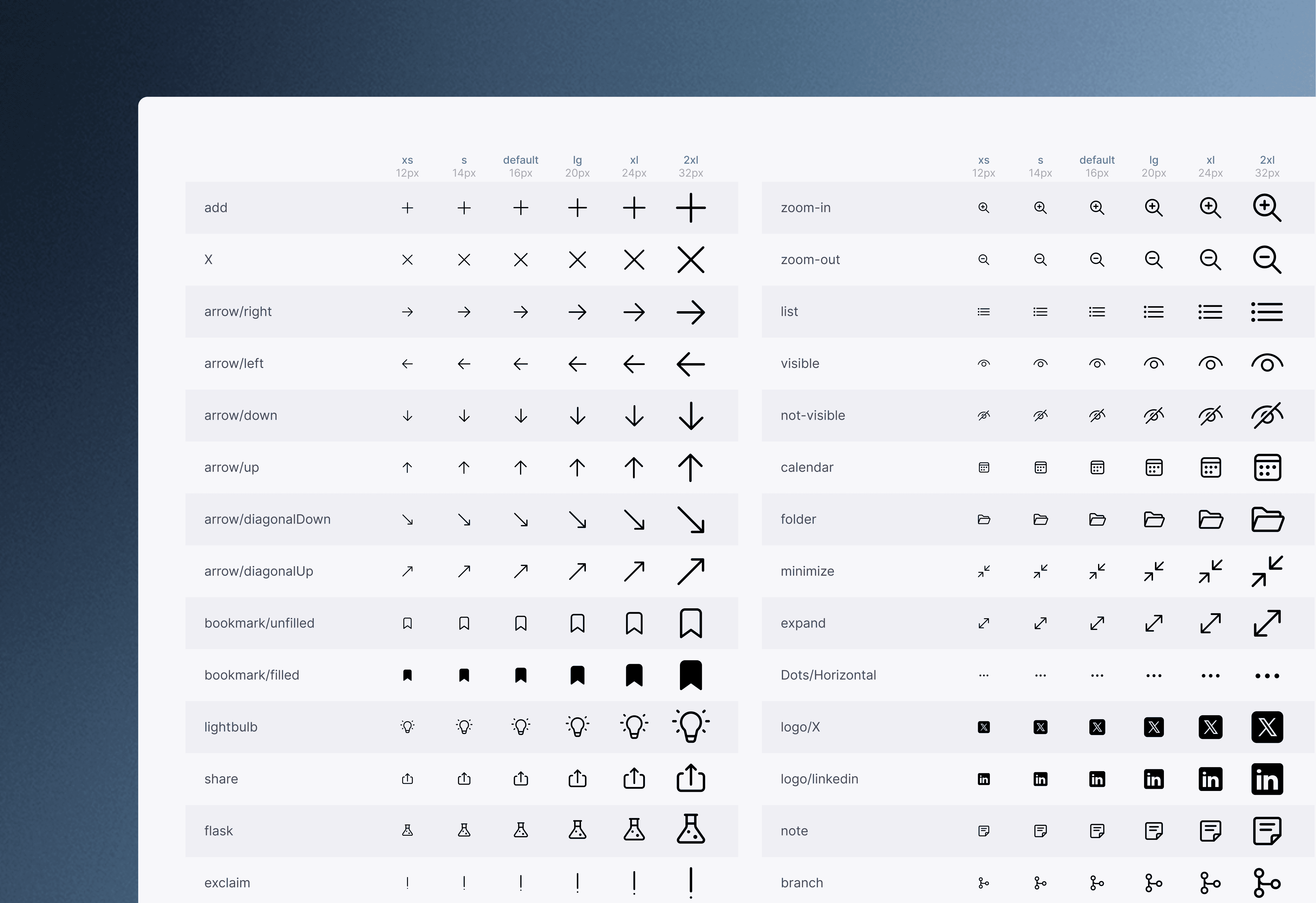
ICONOGRAPHY & UTILITY EXPANSION
Demand-Driven Growth: The icon system grew directly in response to verified product needs rather than speculative UI kits, expanding to 158 custom icons across six size steps.
Micro-Density Adjustments: Smaller size tiers (12px and 14px) were added as interface density increased, accommodating compact control bars and inline metadata without sacrificing clarity.
Specialized Functional Sets: To support upcoming features, we authored dedicated control icons (line styles, custom shape manipulators) that standard icon sets fail to cover. Consistency is enforced through unified stroke weights, corner radii, and a standardized pixel grid.
EVOLUTION & CONTINUOUS ADOPTION
A design system is a living infrastructure, not a finished project. As Aristotle scales, new feature requirements continue to stress-test existing token relationships, surface definitions, and component states. By prioritizing systemic rules over ad-hoc visual decisions, the system has evolved into a resilient foundation that accelerates daily product iteration while maintaining high visual craft.
Last updated — July 2026