Reperch
Role
Product Designer
Team
2 Product Designers & 2 Engineers
Reperch by Remoov
Reperch offers a curated selection of high-quality, pre-owned home goods, including furniture, electronics, appliances, art, and clothing. By centralizing these items in one platform, Reperch simplifies the process of buying second-hand, allowing customers to find unique pieces at accessible prices. This approach not only provides value to consumers but also promotes environmental sustainability by extending the lifecycle of products and reducing waste.
My role
Enhancing Multiple User Flows Across the Reperch Platform
Enhancing Multiple User Flows Across the Reperch Platform
At Reperch, I had the unique opportunity to work across various user flows rather than focusing on a single feature. As a product designer, I collaborated closely with a senior designer and the engineering team to improve different aspects of the platform, from transactional experiences to user engagement.
Unlike my previous roles, where I worked on one dedicated feature for an extended period, my contributions at Reperch spanned multiple areas—including the gift card system, cash-out flow, notifications, integrating product videos on the product page and the landing page. This required me to adapt quickly, maintain design consistency, and ensure seamless interactions across different touchpoints.
Challenges & Objectives
As Reperch grew, the platform required improvements across various user flows to enhance usability, maintain consistency, and support business growth.
As Reperch grew, the platform required improvements across various user flows to enhance usability, maintain consistency, and support business growth.
However, unlike a singular, large-scale project, my work involved tackling multiple smaller yet crucial design challenges across different areas of the platform.
However, unlike a singular, large-scale project, my work involved tackling multiple smaller yet crucial design challenges across different areas of the platform.

Key Challenge
Maintaining Cross-Platform Consistency
Maintaining Cross-Platform Consistency
Since Reperch was powered by Remoov, some features were directly connected between the two platforms. This meant ensuring a seamless user experience and design consistency while accommodating different user journeys.
Since Reperch was powered by Remoov, some features were directly connected between the two platforms. This meant ensuring a seamless user experience and design consistency while accommodating different user journeys.
Fragmented User Experience
Fragmented User Experience
With multiple features evolving at different stages, ensuring a cohesive and intuitive experience across the platform was a challenge.
With multiple features evolving at different stages, ensuring a cohesive and intuitive experience across the platform was a challenge.
Scalability & Feature Integration
Scalability & Feature Integration
Working across various features—including gift cards, the notification system, and the landing page—required ensuring that each design aligned with the platform’s overall structure and could scale as the business evolved.
Working across various features—including gift cards, the notification system, and the landing page—required ensuring that each design aligned with the platform’s overall structure and could scale as the business evolved.
Objectives
Unify the design experience across Reperch and Remoov,
Unify the design experience across Reperch and Remoov,
ensuring consistency in visual and interaction design.
ensuring consistency in visual and interaction design.
Ensure scalability across all design solutions,
Ensure scalability across all design solutions,
allowing the platform to evolve without compromising usability.
allowing the platform to evolve without compromising usability.
By addressing these challenges, I aimed to create a more intuitive, seamless, and scalable platform, ensuring that users had a frictionless experience while interacting with both Reperch and Remoov.
Gift Cards
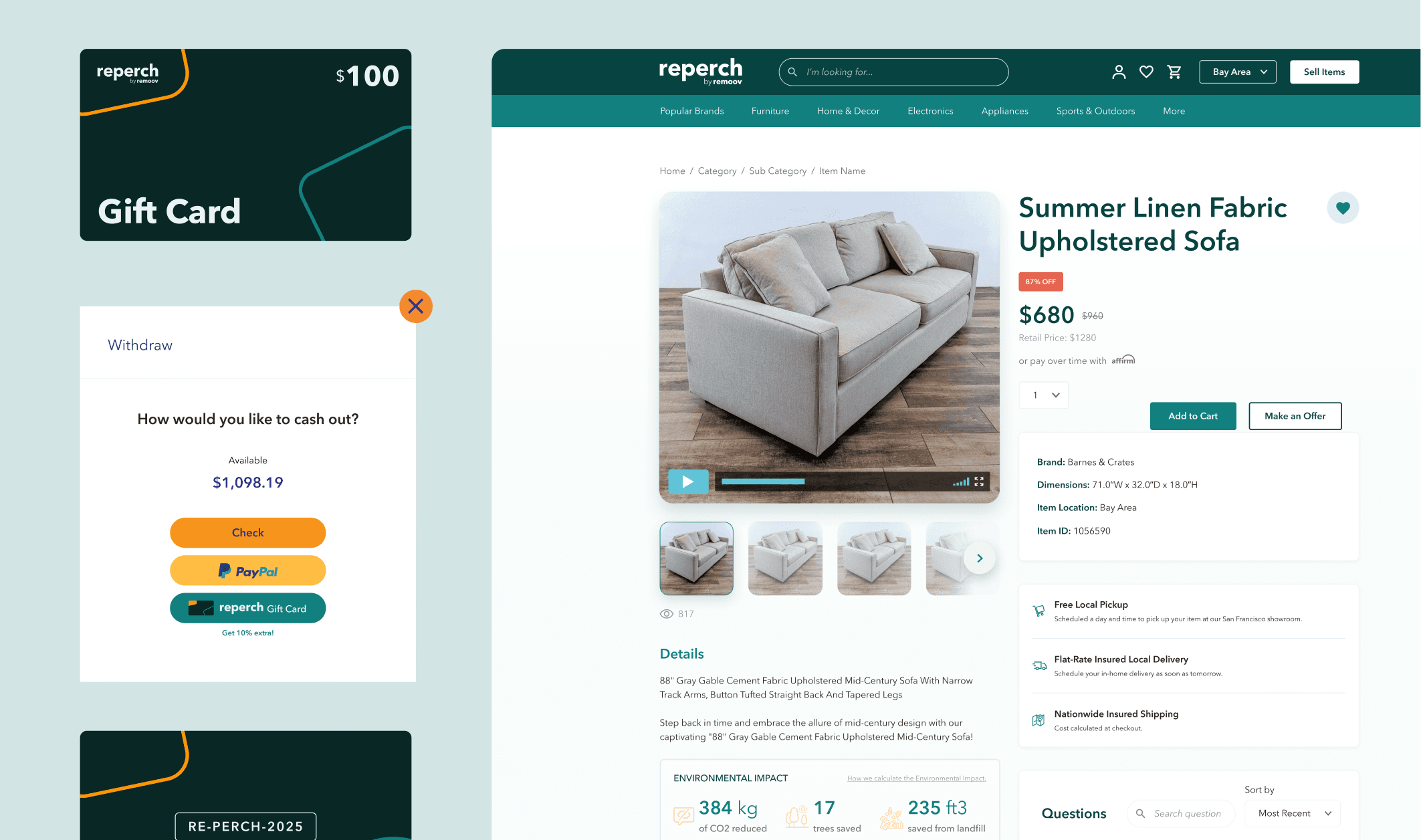
One of the key features I worked on at Reperch was the Gift Card Flow, which provided users with an alternative way to cash out their earnings from Remoov.
Since Reperch and Remoov were interconnected, we wanted to offer users multiple withdrawal options while ensuring a seamless and frictionless experience.
Since Reperch and Remoov were interconnected, we wanted to offer users multiple withdrawal options while ensuring a seamless and frictionless experience.

RE-PERCH-2025
$
1098.19
Gift Card
Challenge
Providing a clear cash-out choice
Users coming from Remoov could cash out their earnings via PayPal, check, or a Reperch Gift Card, and we needed to ensure they fully understood their options.
Users coming from Remoov could cash out their earnings via PayPal, check, or a Reperch Gift Card, and we needed to ensure they fully understood their options.
Encouraging Gift Card Adoption
To incentivize users to choose the Reperch Gift Card, we offered a 10% bonus on their total amount. The challenge was to effectively communicate this value without overwhelming the user.
To incentivize users to choose the Reperch Gift Card, we offered a 10% bonus on their total amount. The challenge was to effectively communicate this value without overwhelming the user.
Reducing friction in the redemption process
If users selected the Reperch Gift Card, they needed a smooth and intuitive way to redeem it on the platform without confusion.
If users selected the Reperch Gift Card, they needed a smooth and intuitive way to redeem it on the platform without confusion.
My Approach
User Flow Optimization
User Flow Optimization
I mapped out the entire cash-out journey, ensuring that choosing the Reperch Gift Card was as straightforward as selecting PayPal or check withdrawal.
I mapped out the entire cash-out journey, ensuring that choosing the Reperch Gift Card was as straightforward as selecting PayPal or check withdrawal.
I minimized unnecessary steps to create a frictionless selection and redemption experience.
I minimized unnecessary steps to create a frictionless selection and redemption experience.

Clear Value Communication
Clear Value Communication
I designed an intuitive UI that highlighted the 10% bonus offer, making it easy for users to compare the benefits of different withdrawal methods.
I designed an intuitive UI that highlighted the 10% bonus offer, making it easy for users to compare the benefits of different withdrawal methods.
Ensured the messaging was concise and persuasive to encourage adoption.
Ensured the messaging was concise and persuasive to encourage adoption.
Withdraw
How would you like to cash out?
Available
$1,098.19
Check

Gift Card
Get 10% extra!
Designing a Seamless Redemption Experience
Designing a Seamless Redemption Experience
Integrated the gift card balance directly into the user’s Reperch account to eliminate manual input or extra verification steps.
Integrated the gift card balance directly into the user’s Reperch account to eliminate manual input or extra verification steps.
Used familiar design patterns from other financial transactions on the platform to maintain consistency.
Used familiar design patterns from other financial transactions on the platform to maintain consistency.

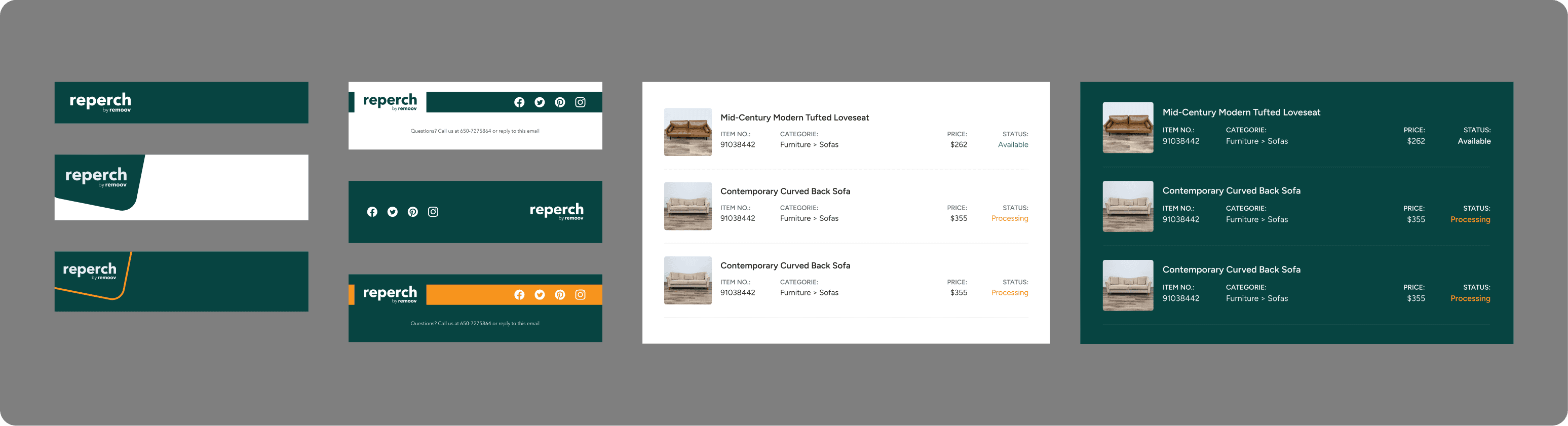
Notification System
For the notification system, my focus was on creating a scalable and adaptable design framework that could be seamlessly integrated into various user notifications, particularly email communications.
For the notification system, my focus was on creating a scalable and adaptable design framework that could be seamlessly integrated into various user notifications, particularly email communications.
The goal was to ensure consistency while allowing flexibility for different types of messages, such as ...
The goal was to ensure consistency while allowing flexibility for different types of messages, such as ...
Cart abandonment reminders
Cart abandonment reminders
Price drop alerts
Price drop alerts
Item availability updates
Item availability updates

Challenge
Building a Mini Design System
Building a Mini Design System
I worked on defining consistent design elements, such as typography, color, layout, and hierarchy, to ensure a cohesive look and feel across different notifications.
I worked on defining consistent design elements, such as typography, color, layout, and hierarchy, to ensure a cohesive look and feel across different notifications.
Ensuring Adaptability & Scalability
Ensuring Adaptability & Scalability
Since notifications varied in content and urgency, I focused on designing modular components that could adapt dynamically to different email formats and layouts.
Since notifications varied in content and urgency, I focused on designing modular components that could adapt dynamically to different email formats and layouts.
Outcome
Created a flexible notification design system that streamlined the email design process while maintaining consistency.
Created a flexible notification design system that streamlined the email design process while maintaining consistency.
Ensured that notifications aligned with Reperch’s branding while being adaptable for different email contexts.
Ensured that notifications aligned with Reperch’s branding while being adaptable for different email contexts.
Improved clarity and user engagement through well-structured layouts.
Improved clarity and user engagement through well-structured layouts.
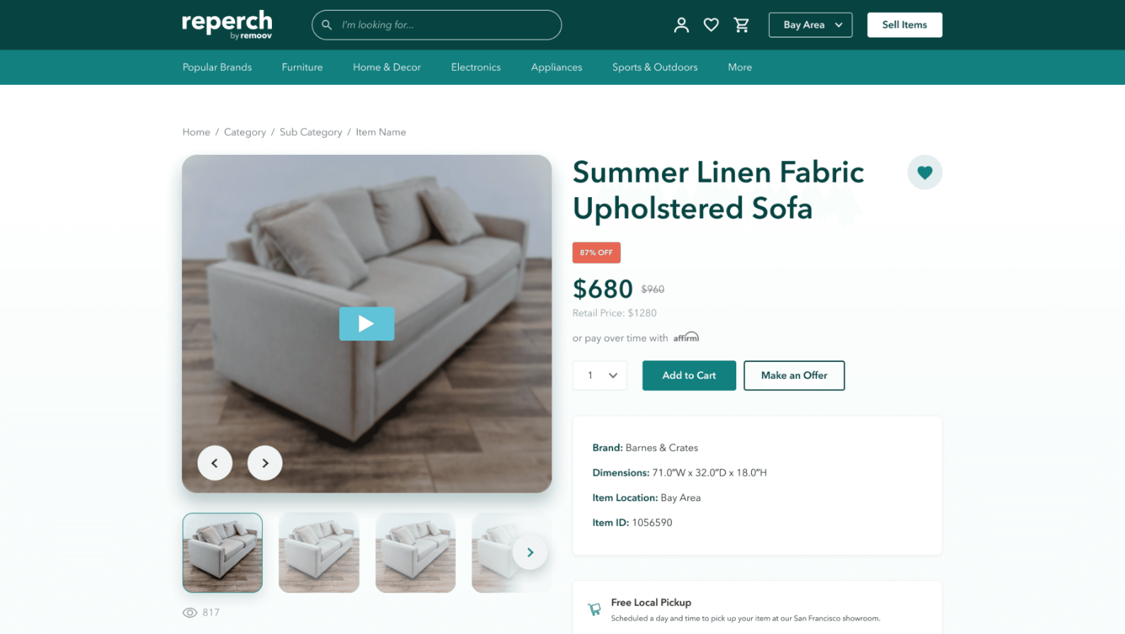
Integrating Product Videos on the Product Page
Integrating Product Videos on the
Product Page
Another key project I worked on at Reperch was the integration of product videos into the product detail page.
Another key project I worked on at Reperch was the integration of product videos into the product detail page.
The goal was to enhance the shopping experience by providing users with a dynamic and interactive way to explore products beyond static images.
The goal was to enhance the shopping experience by providing users with a dynamic and interactive way to explore products beyond static images.

Challenges & Constraints
Technical Constraints with Vimeo
Technical Constraints with Vimeo
he development team opted to use Vimeo as the video integration solution, which came with predefined UI elements and functionality (e.g., play button, progress bar, volume control, expand/collapse view).
he development team opted to use Vimeo as the video integration solution, which came with predefined UI elements and functionality (e.g., play button, progress bar, volume control, expand/collapse view).
Maintaining a Seamless User Experience
Maintaining a Seamless User Experience
The video player needed to blend naturally with the existing product page design while adhering to Vimeo’s constraints.
The video player needed to blend naturally with the existing product page design while adhering to Vimeo’s constraints.
Optimizing for Different Devices
Optimizing for Different Devices
Ensuring that the video experience was consistent across desktop and mobile without disrupting the overall page layout and usability.
Ensuring that the video experience was consistent across desktop and mobile without disrupting the overall page layout and usability.
My Approach
Designing an Intuitive Video Placement
Designing an Intuitive Video Placement
Placed the video within the existing product image gallery, allowing users to seamlessly switch between images and video.
Placed the video within the existing product image gallery, allowing users to seamlessly switch between images and video.
Aligning with Vimeo’s UI Elements
Aligning with Vimeo’s UI Elements
Worked closely with developers to ensure that Vimeo’s play button, progress bar, and volume controls were styled to match Reperch’s design system.
Worked closely with developers to ensure that Vimeo’s play button, progress bar, and volume controls were styled to match Reperch’s design system.
Optimized the expand-to-fullscreen functionality, ensuring it worked intuitively across different screen sizes
Optimized the expand-to-fullscreen functionality, ensuring it worked intuitively across different screen sizes

Outcome
Successfully integrated product videos while maintaining design consistency and usability.
Successfully integrated product videos while maintaining design consistency and usability.
Improved user engagement by allowing shoppers to visualize products more effectively and streamlined communication between design and development, ensuring a smooth implementation within the given constraints.
My work on Reperch is an ongoing journey,
with continuous improvements and new features being developed. As the platform evolves, I am actively working on refining user flows, enhancing the overall experience, and tackling new design challenges.
I will continue updating this case study with new projects, iterations, and insights as they unfold. Stay tuned for more updates! 🚀